

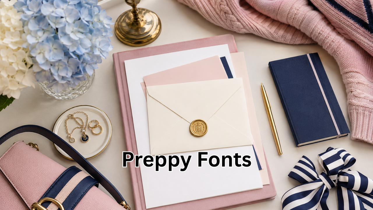
Typography plays a major role in creating memorable designs, and one style that continues to grow in popularity is preppy fonts. Whether you’re designing social media graphics, invitations, logos, school-themed projects, or branding materials, the right preppy font can instantly add a polished, elegant, and youthful touch.
Preppy typography combines sophistication with fun. Inspired by classic collegiate aesthetics, coastal fashion, and timeless design trends, these fonts are versatile enough for both personal and professional projects.
In this guide, you’ll learn what preppy fonts are, their key characteristics, where to use them, how to choose the right one, and the best practices for making your designs stand out.
What Are Preppy Fonts?
Preppy fonts are typography styles that reflect the classic “prep school” aesthetic. They often feature clean lines, elegant curves, and balanced proportions while maintaining a modern and approachable appearance.
The preppy style originated from elite schools and Ivy League fashion, but today it has evolved into a broader design trend associated with:
- Minimalist elegance
- Bright, cheerful colors
- Coastal-inspired themes
- Sophisticated branding
- Modern feminine aesthetics
- Timeless fashion
Unlike overly decorative fonts, preppy fonts emphasize readability while maintaining a stylish personality.
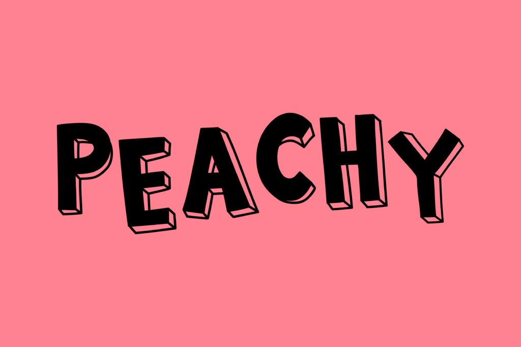
Characteristics of Preppy Fonts
Although there isn’t one official preppy font style, most fonts in this category share several common features.
Clean and Readable
Preppy fonts avoid excessive decoration. Their clean appearance makes them easy to read in both print and digital formats.
Elegant Letterforms
Many preppy fonts include refined serifs, smooth curves, or balanced geometric shapes that create a polished look.
Modern Yet Timeless
One reason preppy fonts remain popular is that they rarely go out of style. They blend classic typography with contemporary design trends.
Versatile Design
These fonts work well for everything from luxury brands to lifestyle blogs and wedding invitations.
Popular Types of Preppy Fonts
Different font styles can achieve a preppy aesthetic depending on your project.
| Font Style | Best For | Overall Feel |
|---|---|---|
| Serif Fonts | Invitations, magazines, branding | Elegant and traditional |
| Sans Serif Fonts | Websites, logos, presentations | Clean and modern |
| Script Fonts | Wedding designs, greeting cards | Soft and stylish |
| Rounded Fonts | Social media, planners | Friendly and playful |
| Display Fonts | Headlines and posters | Bold and eye-catching |
Mixing two complementary font styles often produces the best visual results.
Why Preppy Fonts Are So Popular
The popularity of preppy fonts has increased thanks to social media platforms like Instagram, Pinterest, and TikTok, where aesthetic content performs exceptionally well.
Designers appreciate these fonts because they:
- Create a premium appearance
- Improve visual consistency
- Fit multiple industries
- Appeal to younger audiences
- Work across both digital and print media
Their versatility makes them suitable for beginners and professional designers alike.
Best Uses for Preppy Fonts
Preppy fonts are suitable for a wide variety of creative projects.
Branding
Lifestyle brands, boutiques, skincare companies, and fashion labels frequently use preppy fonts to communicate elegance and trust.
Social Media Graphics
Influencers often combine preppy fonts with pastel color palettes to create attractive Instagram posts, Pinterest pins, and TikTok covers.
Wedding Invitations
Classic serif and script combinations help create luxurious invitation designs.
School Projects
Because the style originates from collegiate aesthetics, preppy fonts naturally complement educational presentations and school branding.
Logos
Businesses looking for a timeless identity often choose clean serif or minimalist sans serif fonts.
Printable Products
These fonts work beautifully for:
- Journals
- Calendars
- Stickers
- Planners
- Greeting cards
- Wall art
How to Choose the Right Preppy Font
Choosing the perfect font depends on your design goals.
Consider Your Audience
Think about who will see your design.
For younger audiences, playful rounded fonts often perform well. Luxury brands may benefit from refined serif fonts.
Match the Brand Personality
Your typography should reflect your overall brand identity.
Examples include:
- Luxury → Elegant serif
- Modern → Minimal sans serif
- Creative → Stylish display font
- Feminine → Soft script font
Prioritize Readability
Beautiful typography should still be easy to read. Avoid using decorative fonts for long paragraphs.
Pair Fonts Carefully
A common design technique is combining:
- Serif heading + Sans serif body
- Script heading + Minimal body text
This creates contrast while maintaining readability.
Color Combinations That Complement Preppy Fonts
Typography becomes even more effective when paired with suitable colors.
Popular preppy color palettes include:
- Navy blue and white
- Soft pink and cream
- Sage green and beige
- Light blue and ivory
- Lavender and white
- Emerald green and gold
These combinations create a sophisticated and welcoming appearance.
Mistakes to Avoid
Even attractive fonts can become ineffective when used incorrectly.
Avoid these common mistakes:
- Using too many fonts in one design
- Choosing decorative fonts for long text
- Ignoring spacing between letters
- Using poor color contrast
- Selecting fonts that don’t match your brand
Keeping your typography simple usually creates a stronger visual impact.
Free vs Premium Preppy Fonts
Both free and premium fonts have their advantages.
Free Fonts
Advantages include:
- No cost
- Great for personal projects
- Easy to access
- Large variety
Potential drawbacks:
- Limited uniqueness
- Licensing restrictions for commercial use
Premium Fonts
Benefits include:
- Higher design quality
- Commercial licenses
- Larger font families
- Better kerning and spacing
- More stylistic alternatives
Professional businesses often invest in premium fonts for stronger brand identity.
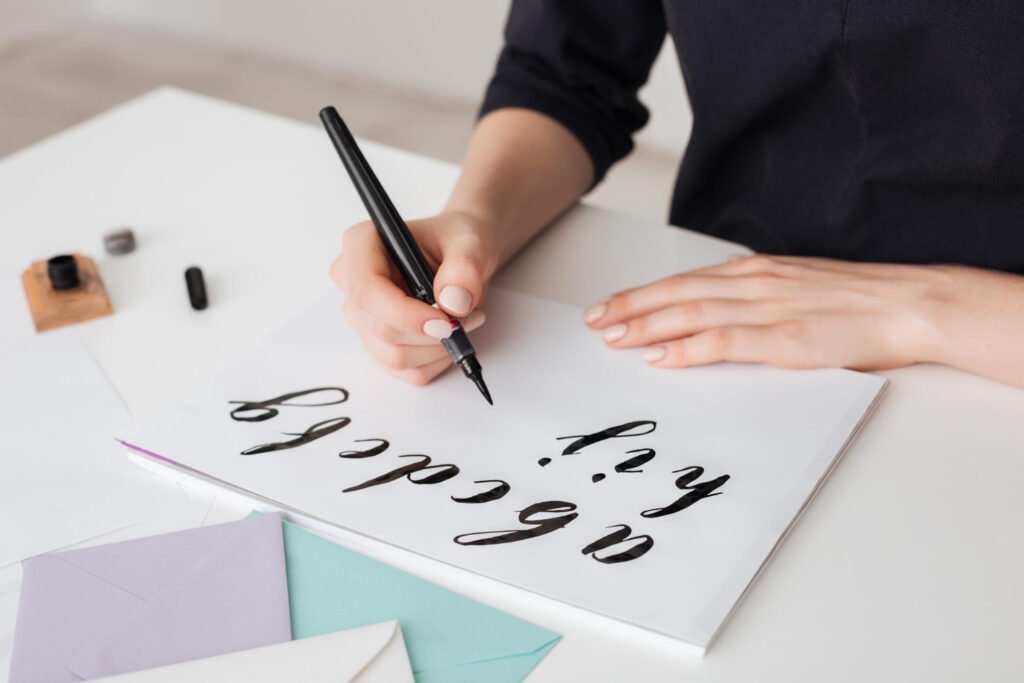
Tips for Designing with Preppy Fonts
To achieve professional-looking results, follow these practical tips.
- Use generous white space.
- Keep layouts uncluttered.
- Pair fonts with simple graphics.
- Limit your design to two font families.
- Maintain consistent font sizes.
- Use bold headings sparingly.
- Choose high-resolution images that complement the typography.
Good typography is often about restraint rather than complexity.
Where to Find Quality Preppy Fonts
Many reputable font libraries offer both free and premium options.
Popular sources include:
- Google Fonts
- Adobe Fonts
- Creative Market
- Envato Elements
- Fontspring
- MyFonts
Always review the license before using any font commercially.
Frequently Asked Questions
Are preppy fonts free to use?
Many preppy fonts are available for free, especially for personal use. However, commercial projects may require purchasing a license.
Which font style looks the most preppy?
Elegant serif fonts are generally considered the most traditional preppy style, although clean sans serif fonts also fit modern preppy designs.
Can preppy fonts be used for business branding?
Yes. Many fashion brands, beauty companies, lifestyle businesses, and boutiques successfully use preppy fonts for logos, packaging, and marketing materials.
Are preppy fonts suitable for websites?
Absolutely. Clean preppy fonts improve readability while giving websites a polished and sophisticated appearance.
Can I combine multiple preppy fonts?
Yes. Pairing a serif heading with a sans serif body font is one of the most effective combinations for balanced and professional typography.
Final Thoughts
Preppy fonts continue to be one of the most versatile typography trends because they balance elegance, readability, and timeless appeal. Whether you’re creating a luxury brand identity, designing social media content, or producing beautiful invitations, the right font can dramatically improve your project’s visual impact.
The key is selecting typography that matches your audience, complements your branding, and remains easy to read across different devices and formats. By keeping your layouts clean, using thoughtful font pairings, and maintaining consistency, you can create designs that feel both stylish and professional.
As design trends evolve, preppy fonts remain a dependable choice for creators who want to achieve a refined, modern, and memorable look.
Also Merot:The Tricks WutawHealth: Practical Wellness Strategies for a Healthier Lifestyl











Leave a Reply